

Appearance, Color & Gradients
The Appearance section of the Design tab controls the visual style of the selected element.
The fill is the interior color of a shape, or the color of text or an icon. For shapes that support gradients (rectangle, circle, ellipse, star, polygon, triangle, curved rectangle) you can choose a solid color or a gradient.
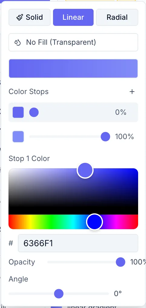
Solid color picker
Section titled “Solid color picker”Click the fill swatch to open the color picker. You can:
- Pick a color in the saturation/value square.
- Drag the hue slider.
- Type an exact hex value in the input field.
Gradient picker
Section titled “Gradient picker”For gradient-capable shapes, a toggle above the color picker lets you switch between Solid and Gradient modes. The gradient is defined by:
- Type — Linear or Radial.
- Angle (linear only) — a single slider from 0° to 360° that sets the gradient direction.
- Color stops — a list of stops, each with its own color (hex picker) and a position slider (0–100%). Click Add stop to insert a new stop (it’s placed in the largest gap automatically), and use the trash icon on a row to delete that stop.
Radial gradient: A circular gradient emanating from a center point; set its stops the same way (the Angle slider doesn’t apply).
Stroke / Border
Section titled “Stroke / Border”A stroke (border) draws a line along the element’s edge.
| Control | Description |
|---|---|
| Stroke color | Color swatch (same picker as fill) |
| Stroke width | Width in px (0–50); set to 0 to remove |
For line and arrow elements the stroke IS the element — the controls are labeled Color and Thickness instead.
Opacity
Section titled “Opacity”A slider from 0% (fully transparent) to 100% (fully opaque). Affects the entire element including any stroke.
Corner Radius
Section titled “Corner Radius”Available on rectangles, curved rectangles, and image elements. Rounds the corners. Enter a value in px, or use a large value to create a pill shape. The helper text reads: “px — use large values for pill shape.”
Shadow
Section titled “Shadow”The Shadow section is collapsed by default. Click to expand it.
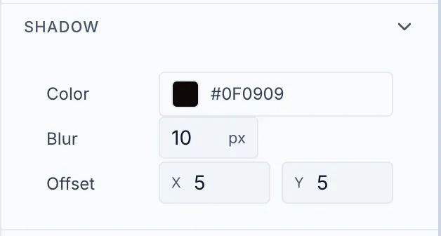
| Control | Description |
|---|---|
| Color | Shadow color (including alpha for semi-transparent shadows) |
| Blur | Blur radius in px (0–100) |
| Offset X | Horizontal shadow offset in px |
| Offset Y | Vertical shadow offset in px |
Set Blur to 0 for a hard-edged shadow. Use negative Offset X/Y values to position the shadow to the top-left.