

Interface Tour
The Designer is divided into seven regions. This page gives you the map; each region has its own deep-dive page.
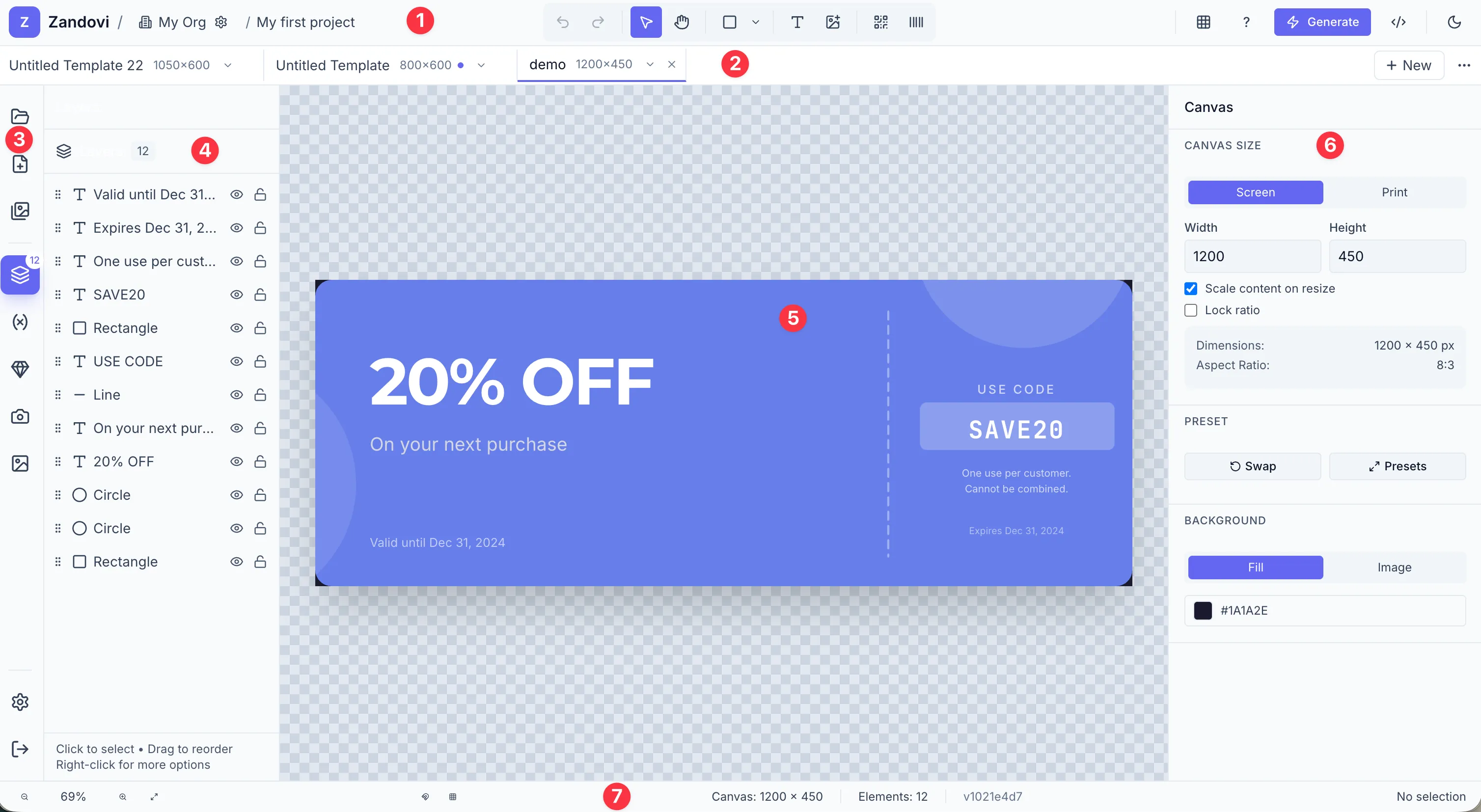
1 — Header
Section titled “1 — Header”The top bar contains (left to right):
- Breadcrumb: Workspace ▾ / Project ▾ — the Z logo (All projects: it takes you back to the full project list, asking first if a tab has unsaved changes), then the workspace switcher (click to switch workspaces), then the current project’s name.
- Project switcher — click the project name (or press
⌘O/Ctrl+O) to open the project menu: a search box, your recent projects, the rest of the workspace’s projects, and All projects…, New project…, Rename project and Project overview. Double-clicking the name still renames the project. - Tool palette — Undo/Redo, Select, Hand, shapes dropdown, Text, Image Variable, QR Code, Barcode.
- Right actions — Use this template (only on a teammate’s shared template), API example, Generate, then Version history (clock icon, on templates you created) and the save status, then the Help menu, Upgrade (or your plan name) and your account menu (avatar), which holds the light/dark theme switch, Settings and Sign out.
The grid and ruler toggles are not in the header; they are in the footer’s zoom menu (see Footer).
On the project overview (no template open) the tool palette, API and Generate are hidden, and so is the footer; only the breadcrumb, Help and your account stay. There is no save indicator there; the dirty dot on a template tab shows unsaved work.
See Adding & Selecting Elements and Setting Up the Canvas.
The Help menu (the ? icon) starts with What’s new, which opens the updates feed. A dot on the Help icon and a count on the What’s new item mean there are unread updates. Below it, Take the tour replays the six-step guided tour from the Quick Start guide, along with Keyboard shortcuts (also on the ? key), Documentation, API reference, and the current build commit.
What’s new
Section titled “What’s new”When new updates are published, a small card appears under the Help icon after you open the app. Dismiss hides it until the next update. Read all updates opens the feed, which you can reopen any time from Help → What’s new, or from the What’s new button on the project list.
2 — Template tab bar
Section titled “2 — Template tab bar”The first tab, ▦ Overview, is always present and stays pinned at the left. It shows the project’s template grid, and it is the selected tab whenever no template is open in the editor (it shows only the ▦ icon while a template is active). After it comes a scrollable row of tabs, one per open template. The + New button adds a new template: it opens the New template dialog. Each tab shows the template’s size, and a small dot when it has unsaved changes. The ⋯ menu at the right end holds the project actions: Switch project… (⌘O / Ctrl+O), New project…, Save as template… and All projects. See Working with Multiple Templates.
3 — Left sidebar rail
Section titled “3 — Left sidebar rail”A narrow icon rail that holds side panels only (68 px wide). A divider separates Templates from the rest:
| Icon | Tooltip | Action |
|---|---|---|
| Grid | Templates | Opens the Templates panel |
| Layers | Layers | Opens the Layers panel |
| Variable | Variables | Opens the Variables panel |
| Shapes | Icons | Opens the Icons panel |
| Image | Images | Opens the Images panel (uploads and stock) |
Project and creation actions live elsewhere: switch project from the breadcrumb or ⌘O, new templates from the tab bar + or the Templates panel, and the project overview from the ▦ tab.
4 — Left panel
Section titled “4 — Left panel”Clicking a panel button in the rail opens a 240 px panel alongside it. Each panel is documented in its own page:
- Templates — Working with Multiple Templates
- Layers — Layers Panel
- Variables — Variable Settings
- Icons — Icons
- Images, with My Images and Stock tabs — Images
5 — Canvas area
Section titled “5 — Canvas area”The main design surface. Shows the canvas at its configured dimensions, with optional rulers, grid, and smart guides. See Navigating the Canvas.
6 — Properties panel
Section titled “6 — Properties panel”A 320 px panel on the right edge. Its content adapts to your current selection:
- Nothing selected → Canvas settings (size, background).
- Single element → the element’s settings as one scrolling list of collapsible sections (Variable, Text, Typography, Position & Size, Appearance, Shadow, Arrange, depending on the element).
- Multiple elements → Align, Distribute, Align to Canvas and Match Size controls, plus Group Selection.
- Group → Group properties (name, opacity, Ungroup Elements).
See The Properties Panel.
7 — Footer
Section titled “7 — Footer”The 32 px bar at the bottom provides:
- Zoom controls (− percentage +, Fit to Screen button). Click the percentage for the zoom and view menu: zoom levels, Fit to screen, Reset, and the Show grid / Show rulers toggles.
- Snapping toggles (Smart guides magnet, Snap to grid grid icon).
- Selection status (far right: No selection, the element type and position, or N elements selected).
The build commit is shown at the bottom of the Help menu.