

The Properties Panel
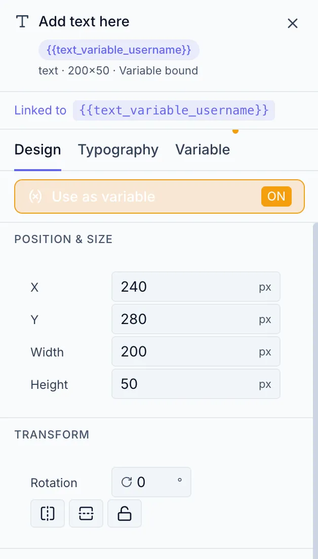
The Properties panel is the 320 px column on the right side of the Designer. Its content changes depending on what is selected on the canvas.
States
Section titled “States”Nothing selected — Canvas settings
Section titled “Nothing selected — Canvas settings”When the canvas is empty or you click an empty area, the panel shows Canvas settings: size presets, dimensions, unit, output intent, DPI, and background fill. See Setting Up the Canvas.
Single element selected
Section titled “Single element selected”The panel shows the element header and up to three tabs:
| Tab | Appears for | Contents |
|---|---|---|
| Design | All elements | Transform, Appearance, element-specific controls, Shadow, Arrange |
| Typography | Text elements only | Font, Auto-Fit, Style, Spacing, Color |
| Variable | Text, Image, QR Code, Barcode — once bound to a variable | Variable binding settings |
Multiple elements selected
Section titled “Multiple elements selected”The panel shows “N elements selected” with a Clear button and a Group button.
Group selected
Section titled “Group selected”The panel shows group properties: element count, an Ungroup button, and a shared Opacity slider.
Element header
Section titled “Element header”When a single element is selected, the panel header shows:
- Element icon (type indicator)
- Element name (first ~24 characters of text content, or element type)
- Variable badge (
{{variableName}}) if the element is variable-bound - State indicators: shown as text in the sub-line (e.g. “Variable bound · Locked · Hidden”), not icons
- Size (width × height in px)
- Close button (X — deselects)
Design tab sections
Section titled “Design tab sections”| Section | What it contains |
|---|---|
| Variable Binding Strip | ”Use as variable” toggle (variable-capable elements) |
| Transform | X, Y, Width, Height |
| Transform — Rotation/Flip | Rotation slider, Flip H, Flip V |
| Appearance | Fill, Stroke/Border, Opacity, Corner Radius |
| Element-specific | QR, Barcode, Icon, Shape-specific controls |
| Shadow | Color, Blur, Offset X/Y (collapsible) |
| Arrange | Layer order buttons, Canvas alignment buttons |
All sections are always visible and scroll vertically. The Shadow section is collapsed by default.